Villa Lumina is a private luxury residence set within a 4-hectare pine forest, 20 minutes from the city centre. With an asking price of €2,100,000 and a target audience that makes decisions based on emotion — not floor plans — the client needed more than a property listing.
They needed a digital experience that could qualify serious buyers, communicate architectural intent, and position the residence alongside Europe's finest private homes. Before a single viewing was booked.
Services
The luxury real estate market is saturated. Every competitor offers the same thing: gallery grids, stock photography, price-per-square-metre tables, and a contact form buried at the bottom.
Villa Lumina had no existing digital presence. No brand guidelines. No photography brief. And a buyer profile that has no patience for anything that feels generic.
Our task was to build from zero — and make every single design decision answer one question: does this feel like a €2M property?
Four stages. One filter running through all of them: would the right buyer take this seriously?
01

We started by mapping the decision journey of a high-net-worth buyer. What do they see before they enquire? What builds trust at this price point? What signals disqualify a property before it's even considered? The answers shaped everything that followed.
02
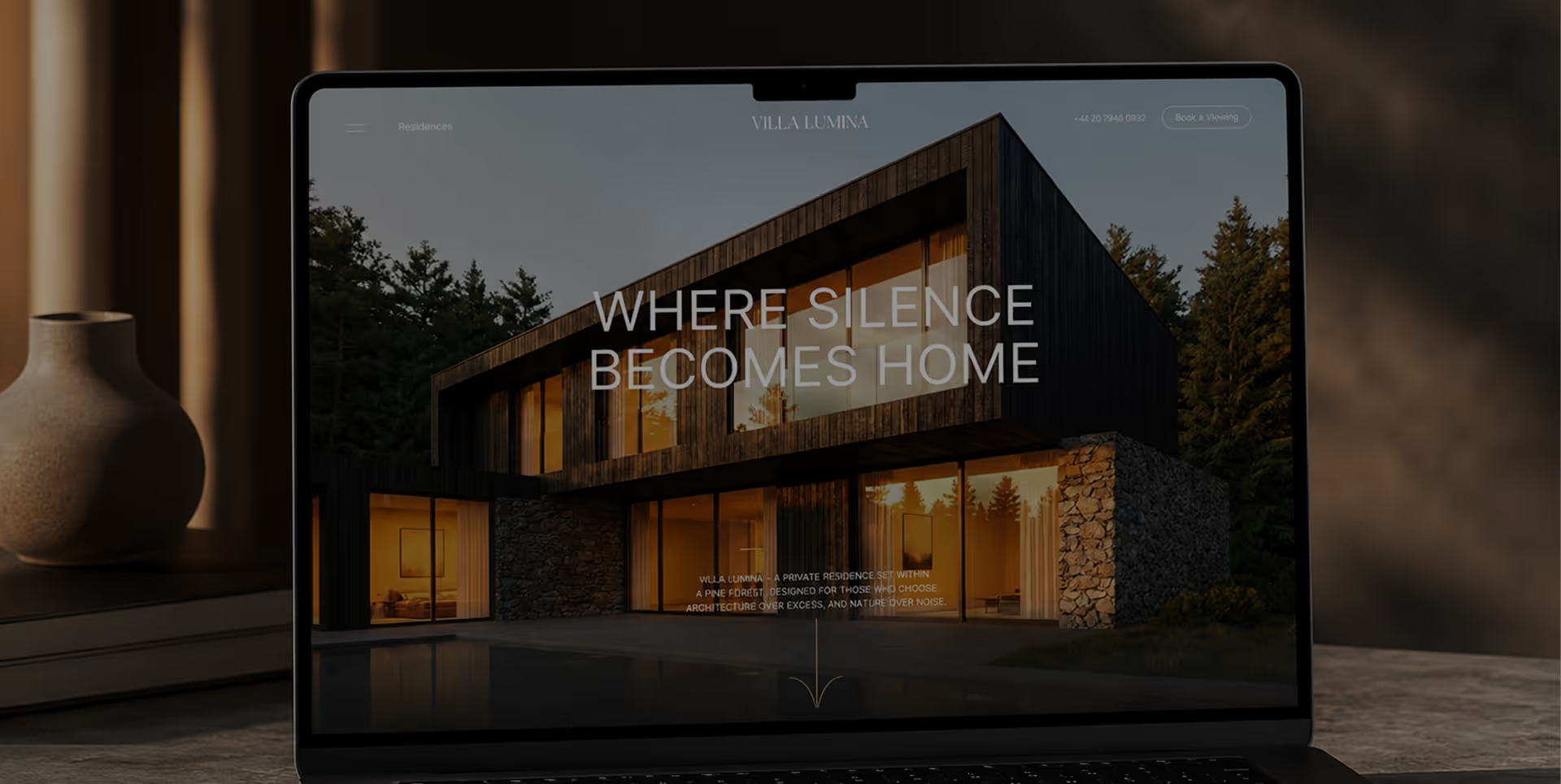
We built a visual language from the architecture itself. Dark timber, natural stone, pine light. Typography chosen to feel structural — precise, restrained, and deliberate. Not a brand that decorates. A brand that communicates the silence of the forest.
03
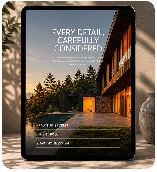
Every screen was treated as a composition, not a layout. Slow reveals, considered whitespace, and intentional friction — designed to slow the right buyer down, not funnel them faster. Built in Webflow for performance, flexibility, and long-term maintainability.
04
Every word was written with a dual purpose: qualify the right buyer, and disqualify the wrong one. No filler. No superlatives. Copy that sounds like architecture feels.
Villa Lumina launched with a digital presence that positioned it alongside Europe's finest private residences. The website became the primary sales tool — driving viewing requests within the first week of going live.
First buyer enquiry
48h
Qualified enquiries
18+
Project delivery
3 months
Want to get results like these for your product?
"Interyflow understood immediately that this wasn't about selling square metres. They built something that sells a way of life. Within the first week we had serious enquiries — people who had already decided before they called."

James Hartwell
Director @Villa Lumina
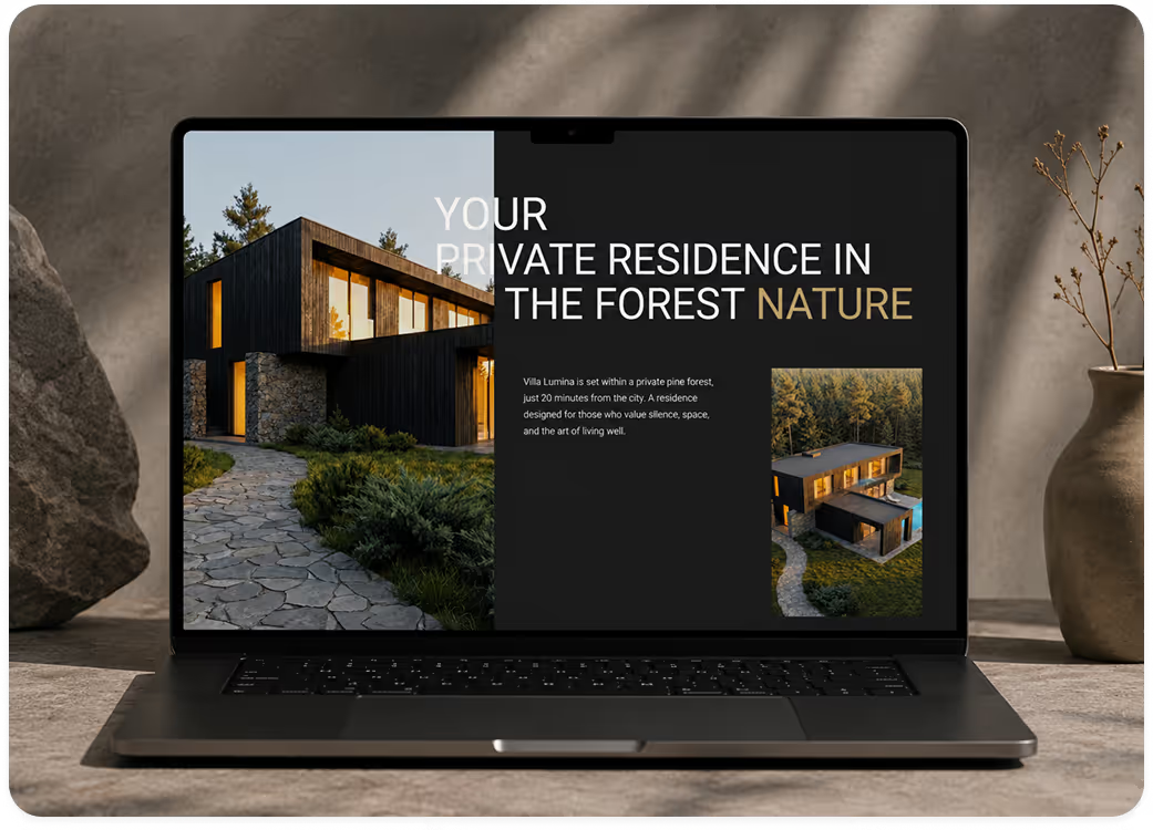
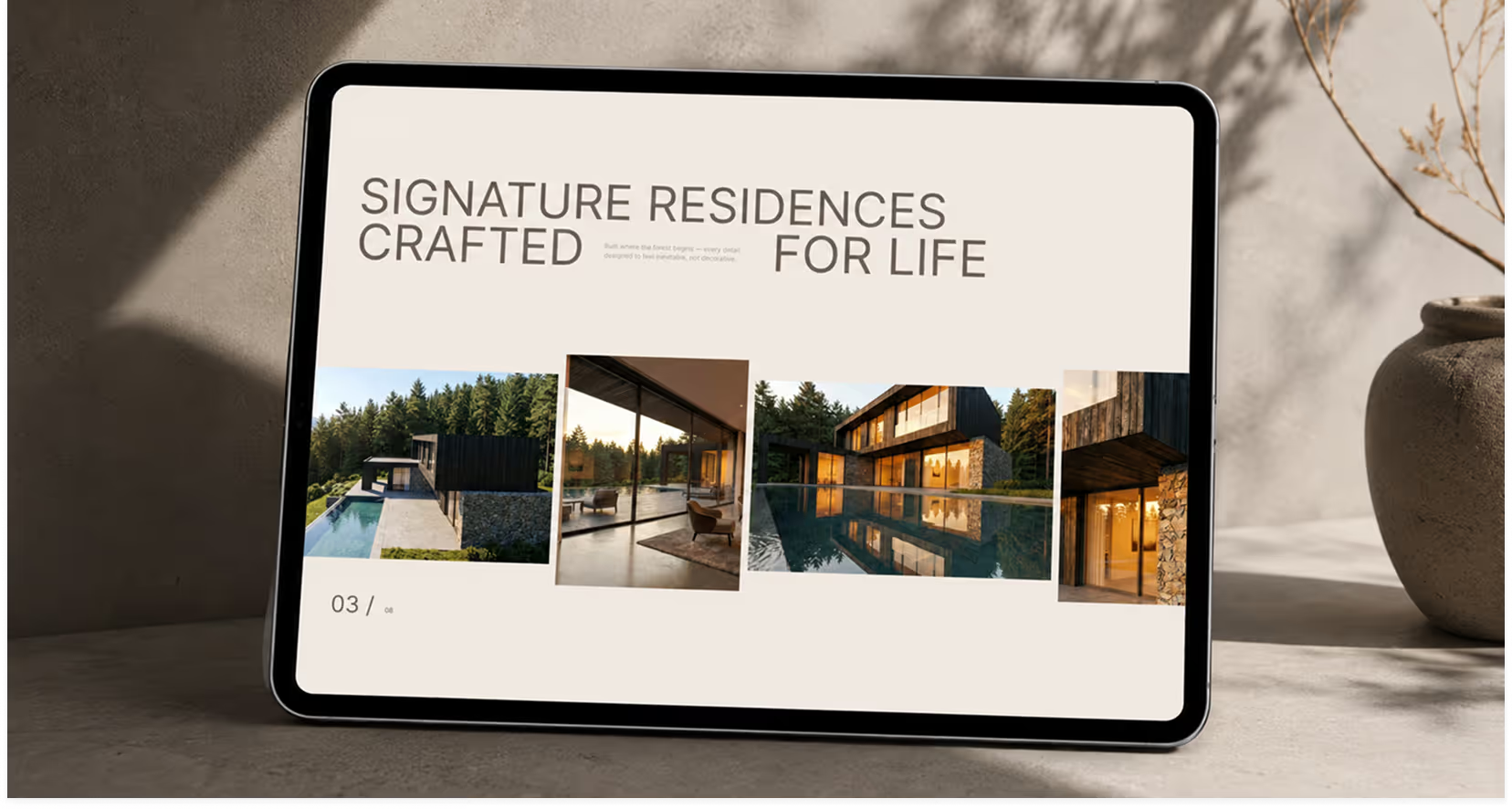
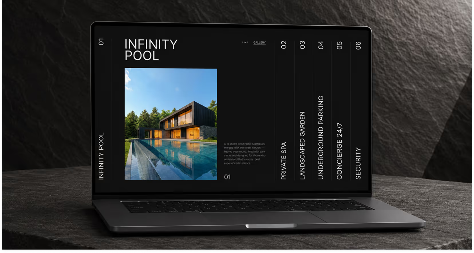
We led with editorial art direction — treating every screen as a composition, not a layout. Dark timber, natural stone, and golden light became the visual language of the entire site, while typography was chosen to feel architectural: precise, restrained, and deliberate. Every word of copy was written with the same intention — to qualify the right buyer and disqualify the wrong one.
We mapped the buyer profile, the competitive landscape, and the emotional triggers that drive decisions at this price point. Every subsequent choice — visual, structural, verbal — came from this phase.
Villa Lumina needed a visual language that felt as considered as the architecture itself. We developed a restrained palette, editorial typography, and a photography approach that prioritised atmosphere over specification.
We design and build in Webflow for companies
that compete at the top of their industry.